Oscar Nominations:
Animated Feature
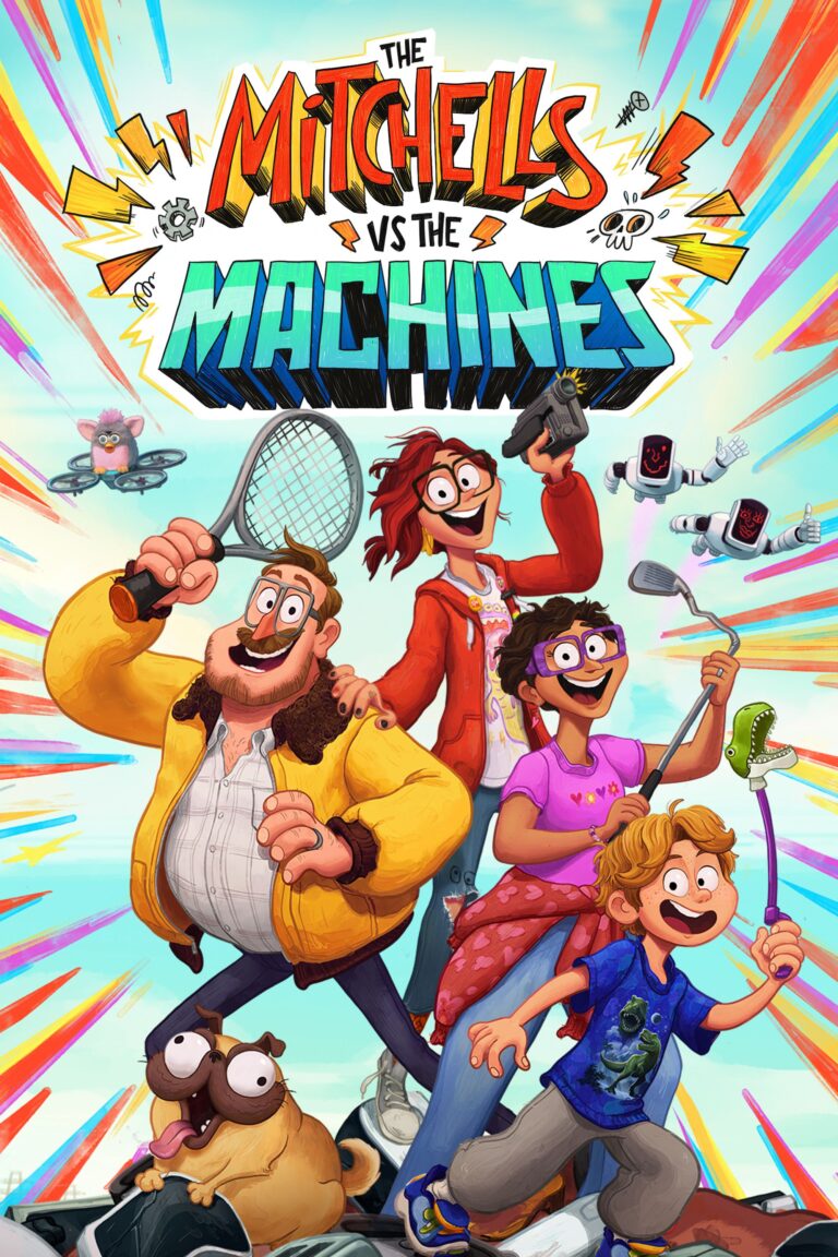
The Mitchells vs the Machines is not only the worst movie I’ve seen this year, but possibly the worst I’ve seen in my lifetime. I have to admit, though, that I appear to be alone in my opinion: my wife called it ‘silly’ but enjoyed the visuals. My granddaughter thought it was the best of this year’s four ‘family’ oriented animated nominees – although when questioned she couldn’t give me a reason. And both critics and audiences alike gave this film higher ratings than either of the two Disney films (Encanto and Raya and the Last Dragon) or Pixar’s Luca. (I haven’t seen the last two, but Encanto was a much better movie.)
There are a few good things about this film. Brian Tallerico (RogerEbert) refers to “…some incredibly strong design work” and sums it up by saying that “it’s never once visually boring, for parents or their more net-savvy children.” And Maya Phillips (New York Times), gave it a Critics Pick and praised its “script packed with bonkers, fast-paced action – with elaborate visuals to match.” The stunning colors and and the visual elements are indeed noteworthy and, if you decide to watch this movie anyway, then definitely pay attention to the visual design (although it is pretty hard not to!).
The movie is the only one of the four family-oriented animation features (previously reviewed FLEE – from Denmark – is a decidedly adult film and so does not compare to the rest) that is not from a Disney studio. Instead it comes to us from Sony Animation studios, which was the same company that gave us the Smurf, Cloudy with a Chance of Meatballs movies, and a movie that I reviewed three years ago, Spider-Man: Into the Spider-Verse. Several people who worked on that latter film also worked on this one and so it isn’t surprising to see some definite comparisons in visual style. For one thing, both films present multiple animation methods. In the Spider-Man movie I enjoyed how each of the six different Spideys were drawn in a distinct comic book style. It was a rich creative approach that belied my own ignorance of comic books (which I admitted). The Mitchells vs the Machines also utilizes several different animation styles, implementing computer animation for much of the backgrounds, more of a two-dimensional, almost motion-capture style for the characters, and then seasoning the film with interjections of other animation methods, including hand-drawn.
But I also found the Spider-Man film to be a bit busy. And, unfortunately, The Mitchells vs the Machines takes that busy-ness to the extreme. The Mitchells live in a world that is actually more like a YouTube video, populated by a seemingly endless stream of meaningless images as well as dozens, maybe hundreds, of Easter Eggs. In my research, I found that the movie contains references to so many other movies, some obvious, and others not so much. Someone, for example, discovered that the socks worn by a character early in the film are in the same exact pattern as the carpet from Kubrick’s The Shining, presumably foreshadowing some ominous futures. But I certainly didn’t catch that, and Kubrick is one of my favorite directors! (It doesn’t help that these socks only appear for a few seconds.)
Unfortunately, that’s just one of many references to films and other pop culture symbols that can be found in The Mitchells vs the Machines. But they go far beyond common movie references. This film, after all, is really about the screen culture of today and so there are references and Easter Eggs to all kinds of YouTube and Instagram viral trenders like animal videos, dancing sequences, and musical rifts that all surface quickly, assault your visual field, and then leave almost as abruptly. But if you aren’t deep into YouTube, you are likely to miss most, if not all, of these Easter Eggs.
Furthermore, the frenetic pace of all this stuff being thrown at you is such that there is really no way to absorb even a fraction of it without actually stopping the movie every minute or so and studying the screen. Someone reported that they found a certain revealing email message in a string of emails from the Mom, (Linda, voiced by Maya Rudolph). In my second viewing – yes, I watch even the movies I don’t like twice just so I can write about them a little better – I looked for that little tidbit and I indeed found it. But it appears on the screen jumbled with a dozen other items and the only way you can actually read it is to stop the movie, back it up, and pause at that spot. If you want to get all the “information” possible out of this movie you will need to watch it a dozen times and hit the pause, back-up, and play buttons frequently. Is it worth it? Well, maybe, if you are thoroughly into current screen culture and have enough time to waste. But I’m doubtful I’m writing to that kind of audience.
Most importantly, though, is that putting that kind of effort into a film’s style must be rewarded by the nature of the story, and it is here that I think the film fails miserably. On the surface, it is a science fiction story about the AI singularity (where AI develops its own consciousness) and, because us humans most likely haven’t constrained our greed enough to develop adequate responses to that event, things get out of control. (Plenty of science fiction has dealt with this idea, as well as thoughtful nonfiction books and essays). Here, though, the saving of humanity becomes the responsibility of a totally, and typically, dysfunctional family, The Mitchells. The movie plays out the story of how a family, trying to bring itself back together, ends up saving the world. The absurdity of the movie’s style is matched only by the ridiculousness of the story. There are some touching moments and I’m not saying the film won’t stir some emotions – follow the repeated references to the little wooden moose to get the best elements of the movie – but the story line jumps between absurdities with such continuous force that you just don’t suspend disbelief, you embrace it!
In the end, this is a creative effort from a team that is working for Disney television. The writers and directors are known most notably for their work on Disney’s, apparently successful, TV series Gravity Falls, a show I know absolutely nothing about. But I can say that if this is similar to that show, then it is a cartoon that emphasizes visual assault and internal clever innuendos over any real substance. This movie also suffers from many efforts by television creatives when they attempt to make a feature length film which is that they usually find it difficult to condense their story into a meaningful two-hour package. I think its just fine that kids like it – why they do is something parents will have to ponder. But I seriously don’t think there is any lasting value in this film. I don’t think I’ve ever done this, but I’m giving The Mitchells vs the Machines half a star (0.5*).
Stream on Netflix, Rent on multiple platforms


